
Bluebell's Chocolate
Brand Identity with Mockups
My Product: My assigned brand is Bluebell's Chocolate and the product is fresh blueberries and cherries dipped in creamy milk chocolate. The target audience is primarily women in their mid 20s to early 50s. The brand is to be marketed as cute, fun, sweet, momentary, and joyful.
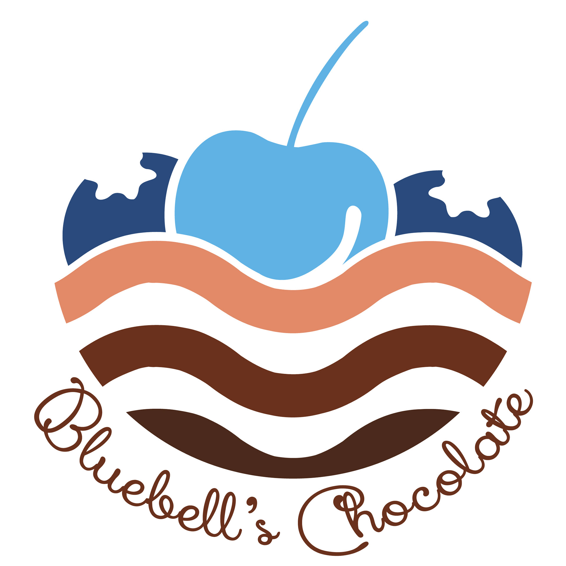
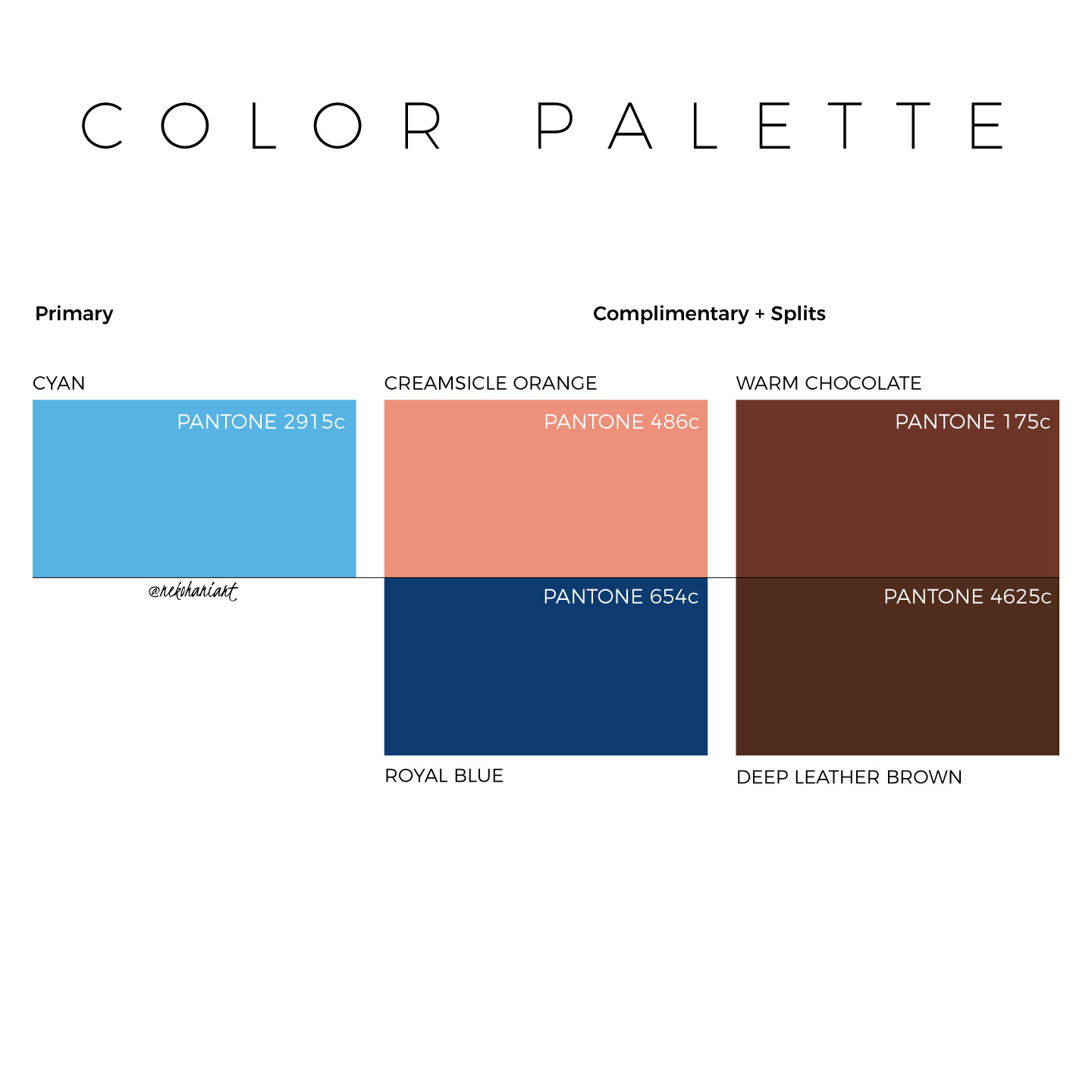
The Logo Idea + Color Choices: I wanted negative space to create shapes and further enhance the logo's appearance. I used waves beneath the fruit to create movement as if the fruit was falling and mixing with the chocolate, causing it to go from light to dark. My color choices are a mix of left complementary colors with my main color, cyan. Being that my brand uses chocolate, I went for warm brown shades as well as creating a connection with the brand's product.
Final Logo Design with color palette
Branding
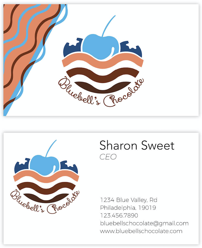
I stayed consistent with my color palette and created marketing designs for various promotional layouts. This includes Business cards, Letterhead, Envelopes, Packaging Flats, and Packaging Prototypes.
You can find it below!
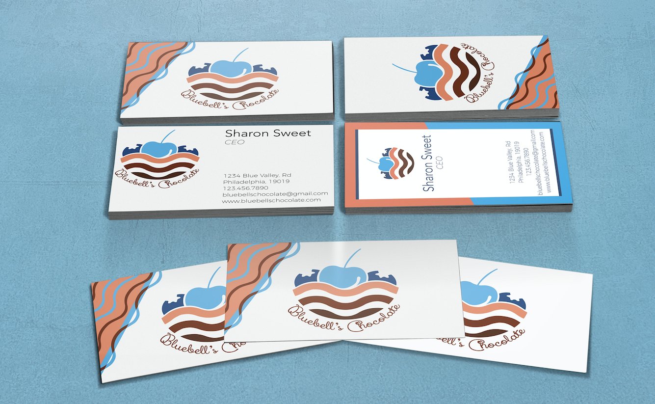
Front + Back of Horizontal Business Card
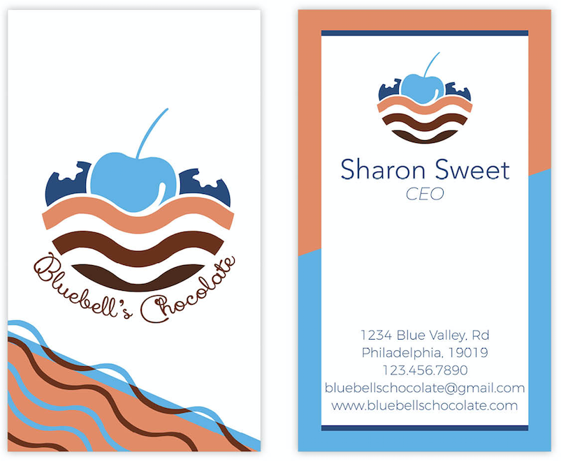
Front + Back of Vertical Business Card
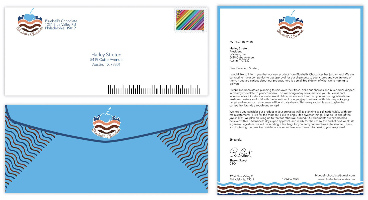
Letterhead + Envelope
Mockups
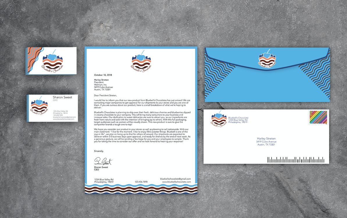
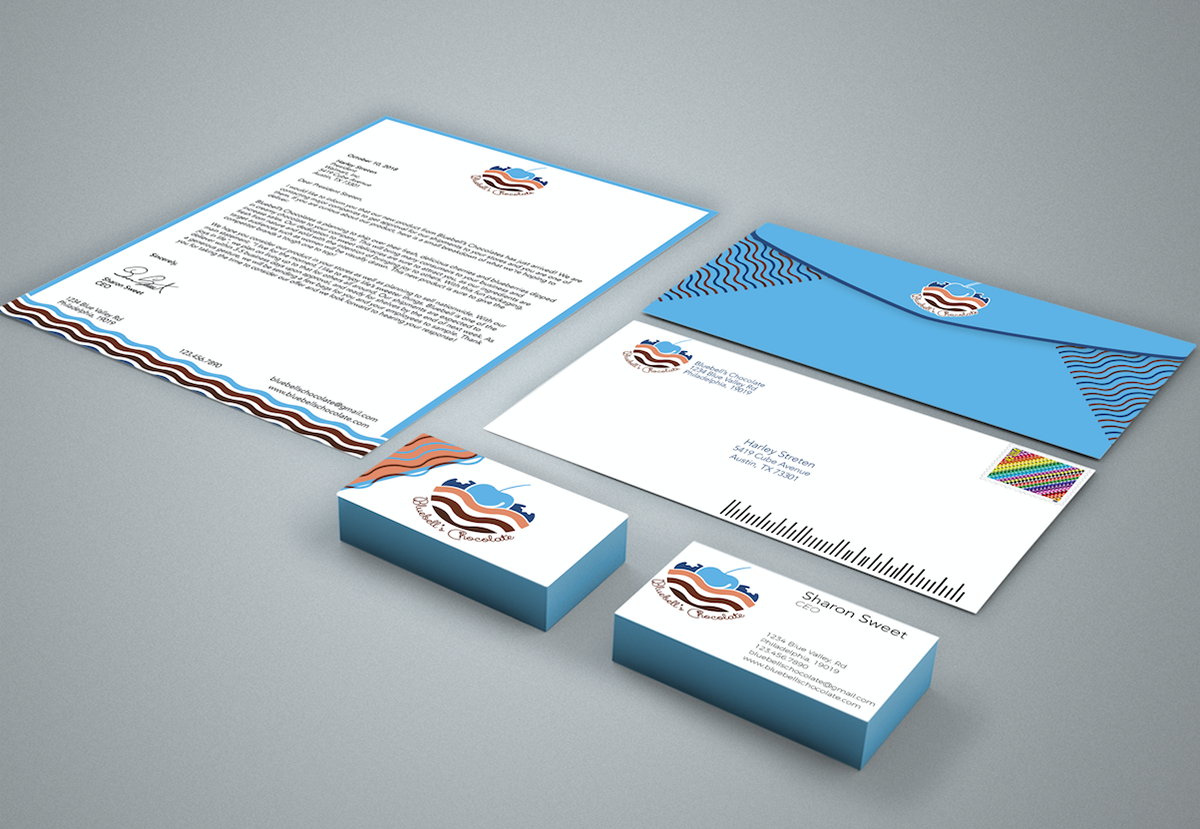
Brand Identity with all layouts
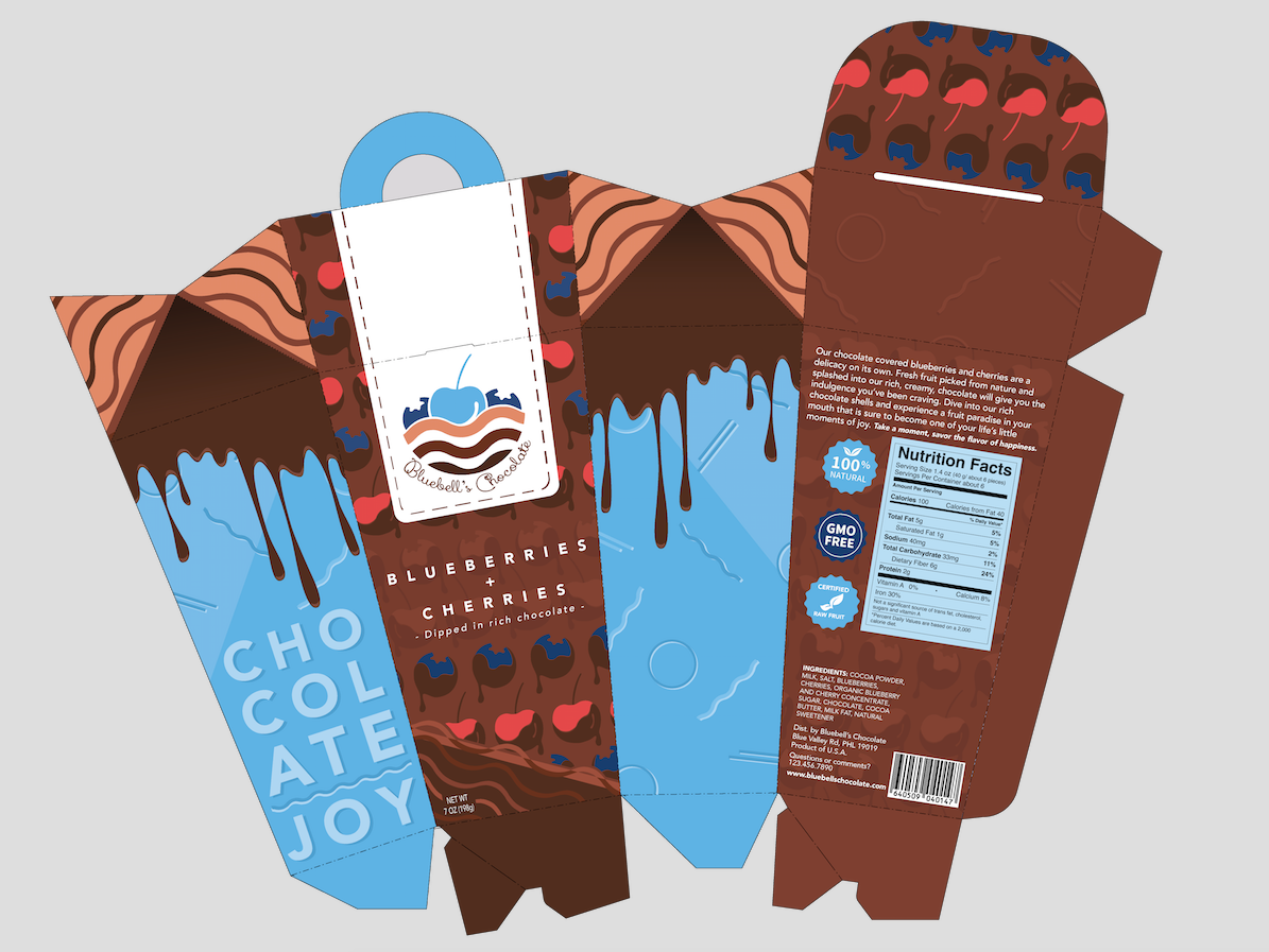
Packaging Design + Prototype
Packaging Flat for initial prototype
Mockup Prototype Idea
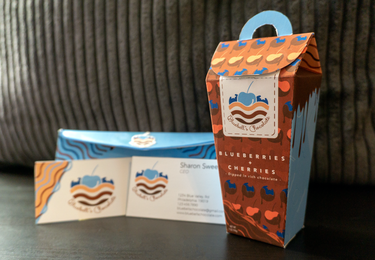
I wanted the front to immediately let people know its a chocolate product. I wanted to use the chocolate covered cherries and blueberries on the flap as well as the front so you can also indicate what it is before reading the text. This style can allow it to be interchangeable with other fruits if this were real. The drips on the side are supposed to give an illusion as if the chocolate was seeping out.
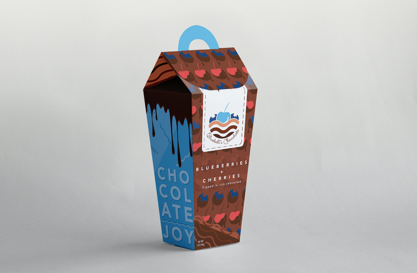
Final
Here a physical prototype stands. I wanted the focus to be primarily on this packaging which is the reason why the others behind it are blurred out a bit. Overall I'm quite satisfied with how this turned out! If you enjoyed seeing the process please make sure to appreciate it below! Thank you.